In data analytics, there are countless best practices. I’ve written a series of articles on this topic, and in this one, I’ll focus on the first question to ask before starting a data analytics project and some important reconciliations to consider.
Start with the Goal—and Sometimes the “Hidden Goal”
We know that creating a professional data analysis deliverable isn’t easy. It often requires significant effort, and sometimes even frustration and tears, to get it done right. However, people are typically more interested in understanding “what the analytics reveal” rather than “how the analytics are done.” If someone has ever told you, “I’m not interested in how you made it; I just want the insights,” you’re not alone!
So, before diving into the data for your analysis project, always ask yourself:
What does the audience want to glean from my analytics?
The audience isn’t a homogenous group and may have both common and different goals. Let’s consider a project like a “People Survey,” which many companies conduct to gauge team sentiment. Before you begin this analysis, ask yourself: Who are the stakeholders in my survey?
It’s always important to ask:

Stakeholders can have various goals:
- Leadership teams who want to assess team bonding and morale.
- Other team members who want to express their opinions anonymously and see if others share their views.
- HR professionals who want to identify areas for improving the work environment.
- …
However, these are just the “superficial” goals.
Don’t forget the “hidden goals”: Every piece of data serves a purpose, especially in recurring projects like the People Survey (often conducted annually). Therefore, it’s crucial to consider the message you want to convey with the data. For instance, when morale is low, highlighting positive aspects from the survey can be uplifting for the team. Keeping this in mind helps clarify the direction of your analysis.
However, considering only the stakeholders’ end goals isn’t enough to deliver the analysis they expect. Another critical element is “how to compare.”
Some Methods Aren’t “Scientific” but Serve the Purpose
In data analysis, there are various ways to make comparisons using different benchmarks. Examples of benchmarks include:
- Timeline-based: year-over-year, month-over-month, holiday vs. non-holiday, etc.
- Demographic-based: gender, age, income, profession, etc.
- Geographic-based: country, city, city vs. town, large cities vs. small towns, etc.
- …
Different stakeholders may be interested in different “comparison benchmarks,” as their definitions of “comparison” can vary.
Returning to the People Survey analysis, ask yourself: What comparisons might be most insightful for the stakeholders? In other words, what types of comparisons will help them gain the insights they need?
After interpreting the data and discussing it with stakeholders, I defined the following dimensions for comparison:
- Dimension One: Level comparison (equivalent to position title or seniority). In my consulting work, these levels are well-defined and captured in the survey.
- Dimension Two: Timeline comparison. We conduct the same survey twice per year, so the selected benchmarks for this analysis are “the last survey” and “the survey from one year ago.”
However, the tricky part is that the comparison isn’t always “scientific” from every perspective.
For example, the content of a People Survey is highly “subjective” and “personal,” as it’s about how people feel. Different people perceive things in vastly different ways. When measuring team satisfaction, the ideal approach is to measure it within the same group of people, with “timeline” as the variable.
In my analysis, it isn’t as “scientific” as it could be. Given the high turnover rate in my industry, over 25% of the workforce has changed compared to one year ago. So, from a purely technical standpoint, it isn’t scientific to compare the results with the previous year’s survey since the “population” in the analysis isn’t the same.
Technically, I should compare the survey with an edition where the team remains (almost) the same to measure satisfaction accurately—an apples-to-apples comparison.
However, from the team leaders’ perspective, “overall team satisfaction” isn’t necessarily tied to a specific group of people but can extend to the “overall team spirit,” even if represented by a different group. Thus, this comparison, though not “scientific” from a technical standpoint, may be exactly what the team leader needs.
This again underscores the importance of “knowing what your stakeholders want.”
Build Your Dimensional Data Like a Pro
Regardless of the size of your analytics project, the effort to build dimensional data properly and model the data correctly always pays off.
It can be tempting to use a flat table for a small analysis project because it’s initially easier. However, when building calculation measures and visualizations, you’ll likely find that you can’t avoid creating dimension tables and data models. For example, if I don’t build a “position title” table with the correct order, I won’t be able to sort the results by “position seniority” in the visualization.
Every effort pays off: the effort to understand, to build, to explore. So, no matter how your analytics projects vary, always keep best practices in mind.
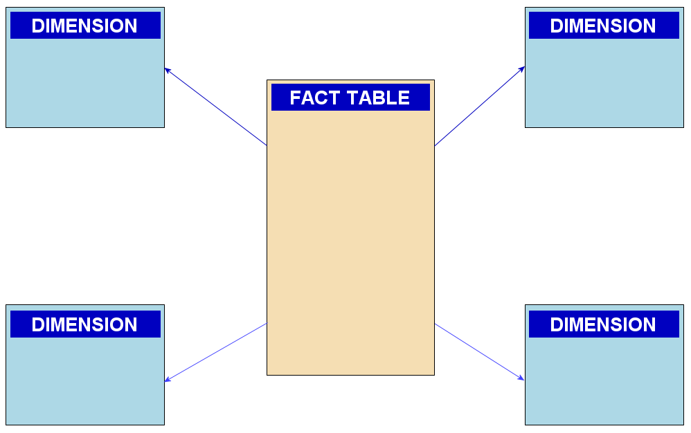
“Star” data schema is always stunning!


